Into The Abyss: The Strange and Curious Case of Microsoft Bob
The Curious Case of Microsoft Bob
In the annals of tech history, few tales are as curious and enigmatic as that of Microsoft Bob. Launched with great fanfare in the mid-90s, Bob was meant to revolutionize the way we interacted with our computers, bringing a friendly, approachable face to the often intimidating world of technology.
Yet, despite its noble intentions and ambitious design, Microsoft Bob quickly became a cautionary tale of hubris and miscalculation. Join us as we delve into the curious case of Microsoft Bob, a digital enigma that vanished into the abyss almost as quickly as it appeared.
The Birth of a Digital Friend

The year was 1995. The internet was burgeoning, and personal computers were becoming an essential part of everyday life. Yet, for many, these machines were still arcane and daunting. Enter Microsoft Bob, a software interface designed to make computers more user-friendly, particularly for novice users.
At its core, Bob was an attempt to humanize the computer experience, replacing the cold, technical desktop interface with a warm, inviting virtual home.
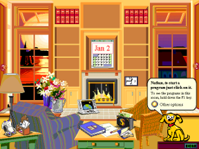
Designed by Melinda Gates, Bob was a labor of love, a project aimed at making technology accessible to everyone. The interface featured a series of cartoon-like rooms, each representing different functions of the computer. Want to write a letter? You’d click on the desk in the living room.
Need to manage your finances? The checkbook on the coffee table was your gateway. Each room was populated by friendly characters, including the now-infamous Rover the dog, who would guide users through their tasks.
The Great Expectations
Microsoft had high hopes for Bob. It was marketed as a breakthrough in user interface design, a software that would democratize technology and make computers as approachable as a friendly neighbor. Bill Gates himself was a vocal supporter, believing that Bob represented the future of user-friendly computing.
For a brief moment, it seemed that Bob might fulfill its lofty promises. The interface was certainly innovative, and its friendly, cartoonish design was a stark contrast to the utilitarian desktops of the time. Early reviews were cautiously optimistic, praising Bob’s creativity and potential.

The Harsh Reality
However, the initial optimism was short-lived. Users quickly discovered that Bob, for all its charm, was deeply flawed. The software required a significant amount of system resources, which many of the computers at the time simply didn’t have. This resulted in sluggish performance and frequent crashes, frustrating users rather than helping them.
Moreover, Bob’s cartoonish interface, while novel, often felt patronizing to adult users. The anthropomorphic characters, designed to be friendly and helpful, were more often seen as intrusive and annoying. Instead of simplifying tasks, Bob sometimes made them more convoluted, as users had to navigate through multiple layers of the virtual home to accomplish simple actions.
The backlash was swift and brutal. Tech reviewers lambasted Bob for its impracticality and resource-heavy demands. Users who had been enticed by its promises of simplicity were left disappointed and frustrated. Within a year of its release, Microsoft quietly pulled the plug on Bob, relegating it to the growing pile of tech misfires.
The Fall into Obscurity
By early 1996, Microsoft Bob was effectively dead. The software that was supposed to revolutionize computing had become a punchline, a symbol of how even the most well-intentioned innovations can go disastrously wrong. Microsoft quickly moved on, focusing on other projects and leaving Bob to fade into obscurity.
Yet, Bob’s story didn’t end there. In the years that followed, it gained a sort of cult status among tech enthusiasts and historians. It became a case study in user interface design, a lesson in the importance of understanding user needs and technological limitations. Bob was a reminder that innovation, while essential, must be tempered with practicality and foresight.
Echoes in the Abyss
Today, the story of Microsoft Bob is a fascinating chapter in the history of technology. It’s a tale of ambition and miscalculation, of how even the biggest companies can stumble when they lose sight of their users’ needs. Bob may have been a failure in its time, but it left an indelible mark on the tech world, influencing future designs and reminding us of the importance of usability and performance.

As we peer into the abyss of deprecated software, we find the ghost of Microsoft Bob, a spectral reminder of an era when the digital frontier was full of wild ideas and bold experiments. Bob’s story is one of creativity and caution, a digital Icarus that soared on the wings of ambition only to fall into the depths of user dissatisfaction.
Thank you for joining us on “Into the Abyss,” where we uncover the rise and fall of forgotten digital titans, one byte at a time. From audacious innovations to their ultimate legacies, stay tuned as we continue exploring the stories that shaped our digital world. Until next time, keep dreaming beyond the horizon with us.
Filed under: Into The Abyss - @ June 15, 2024 1:13 pm